This is how I made a new piece of merchandise!
Before I made it, I did some research for other merchandises, then I drew some special new illustrations.
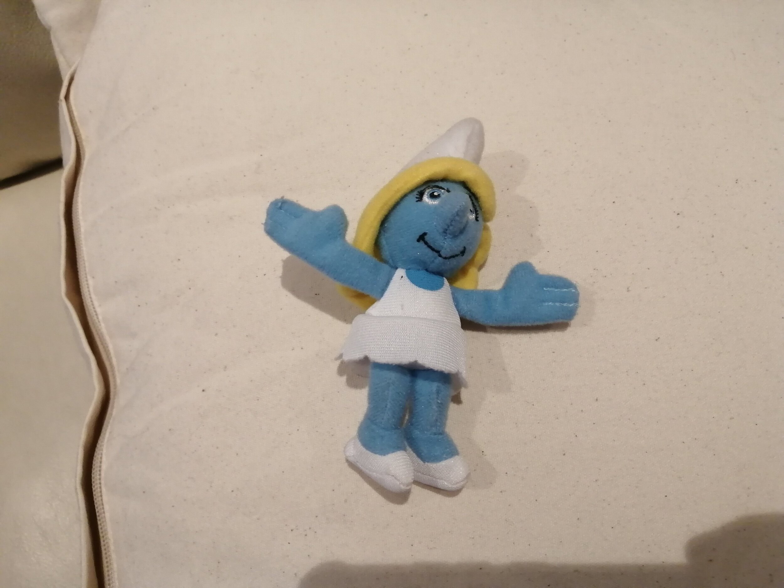
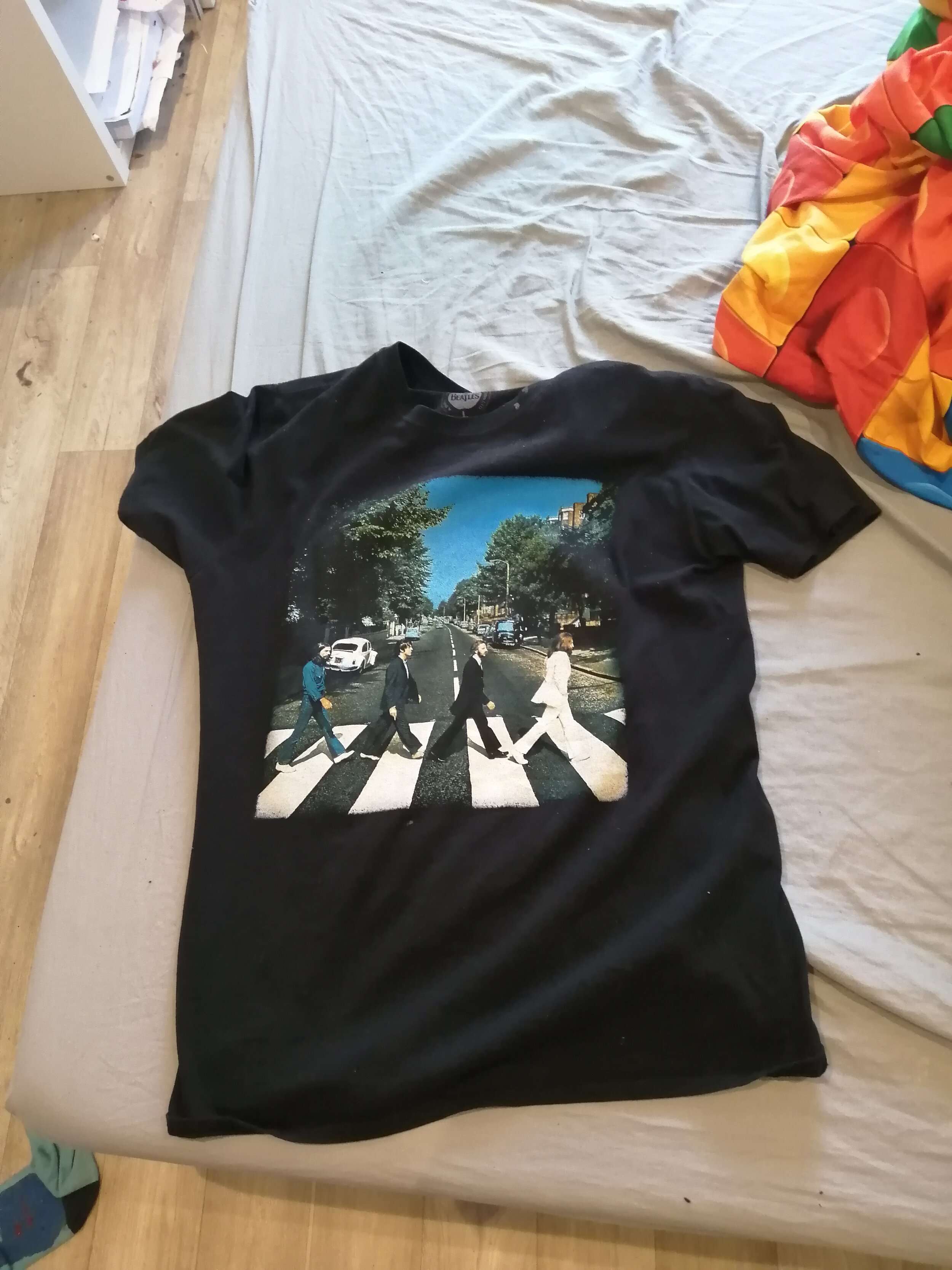
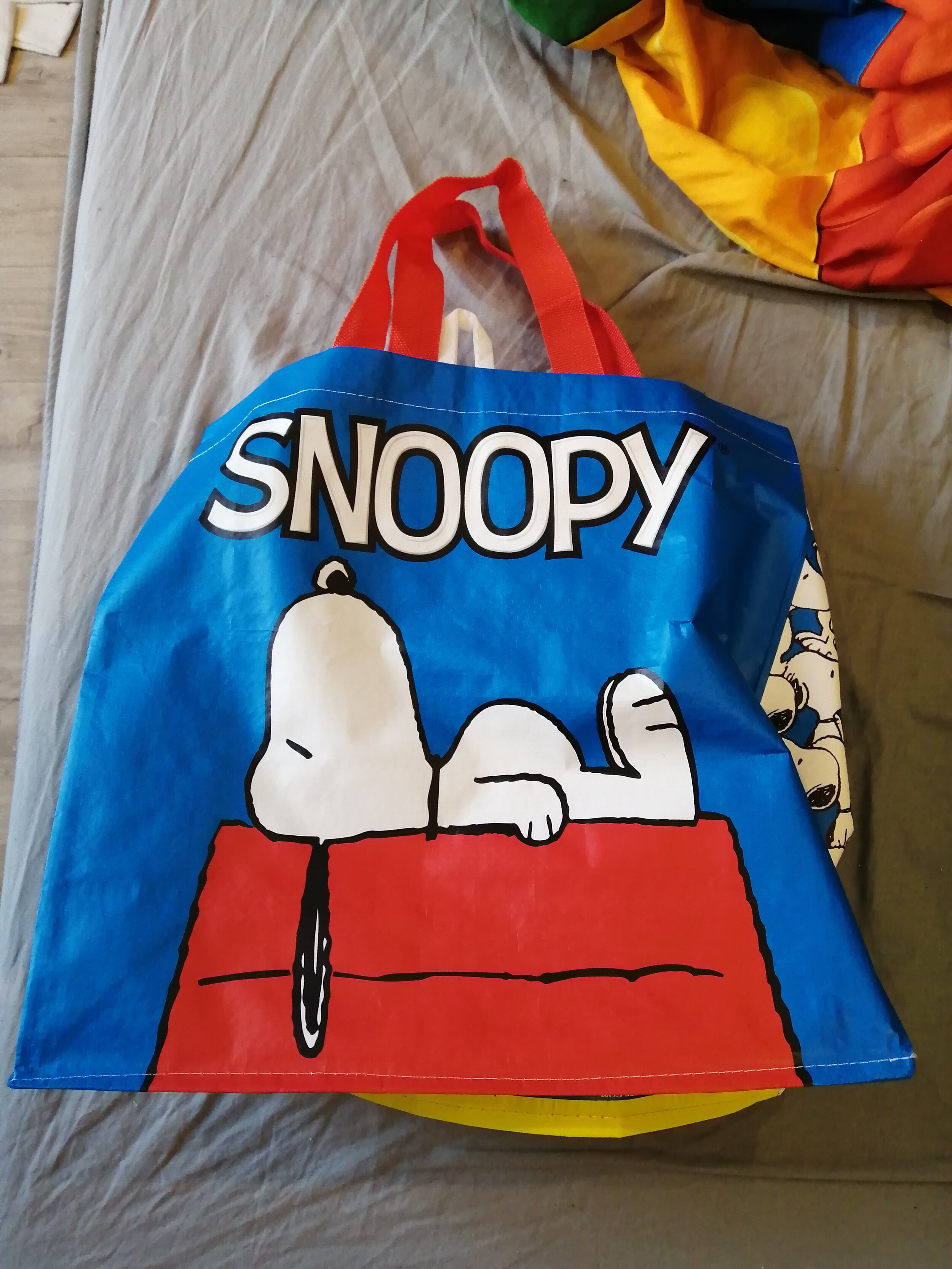
So, what is merchandise? Merchandise is a collection of things based on films, T. V. shows, video games and even history. In the past, I bought and was given different types of merchandise; a Sooty mug, a vintage Thomas The Tank Engine mug-plate, novelizations of films I’m interested in, a giant minion plush (Kevin), a small Smurfette doll, a The Beatles t-shirt and a Snoopy bag.
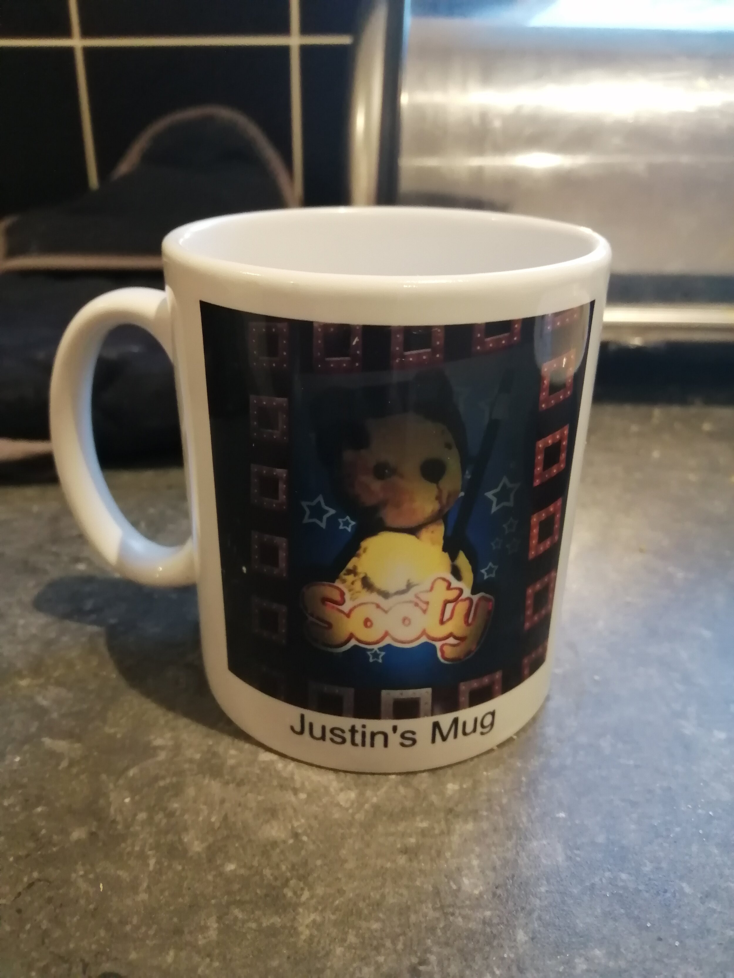
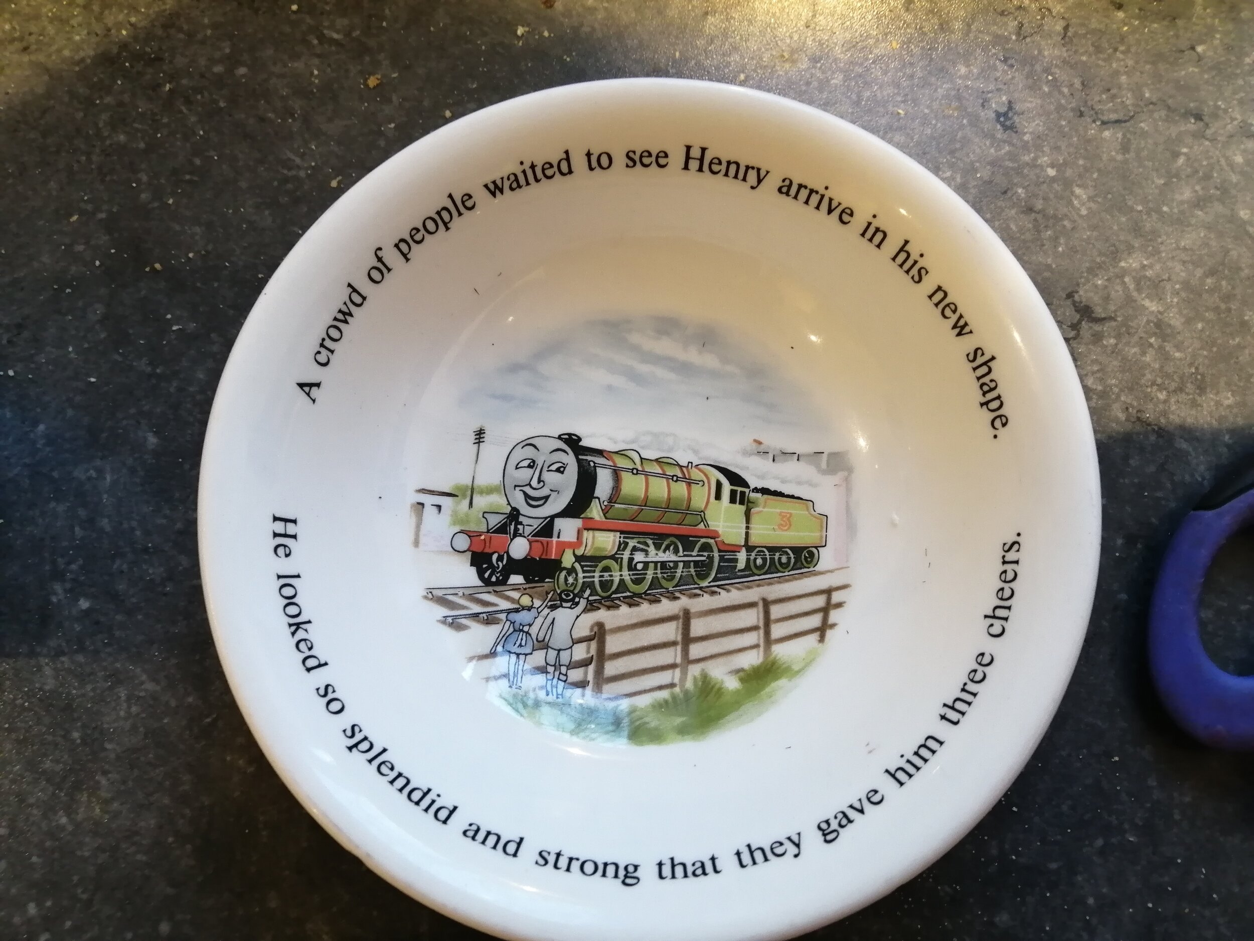
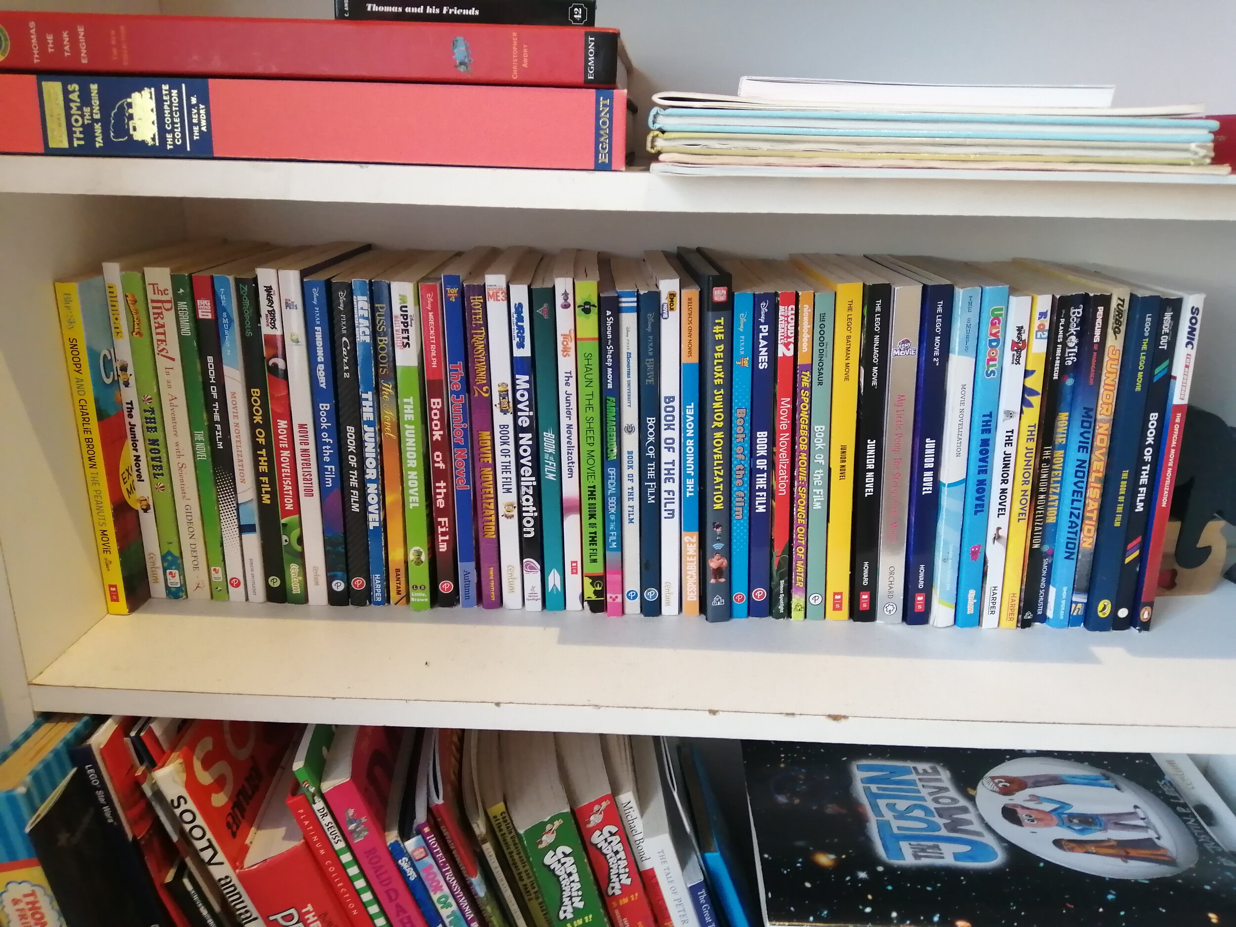
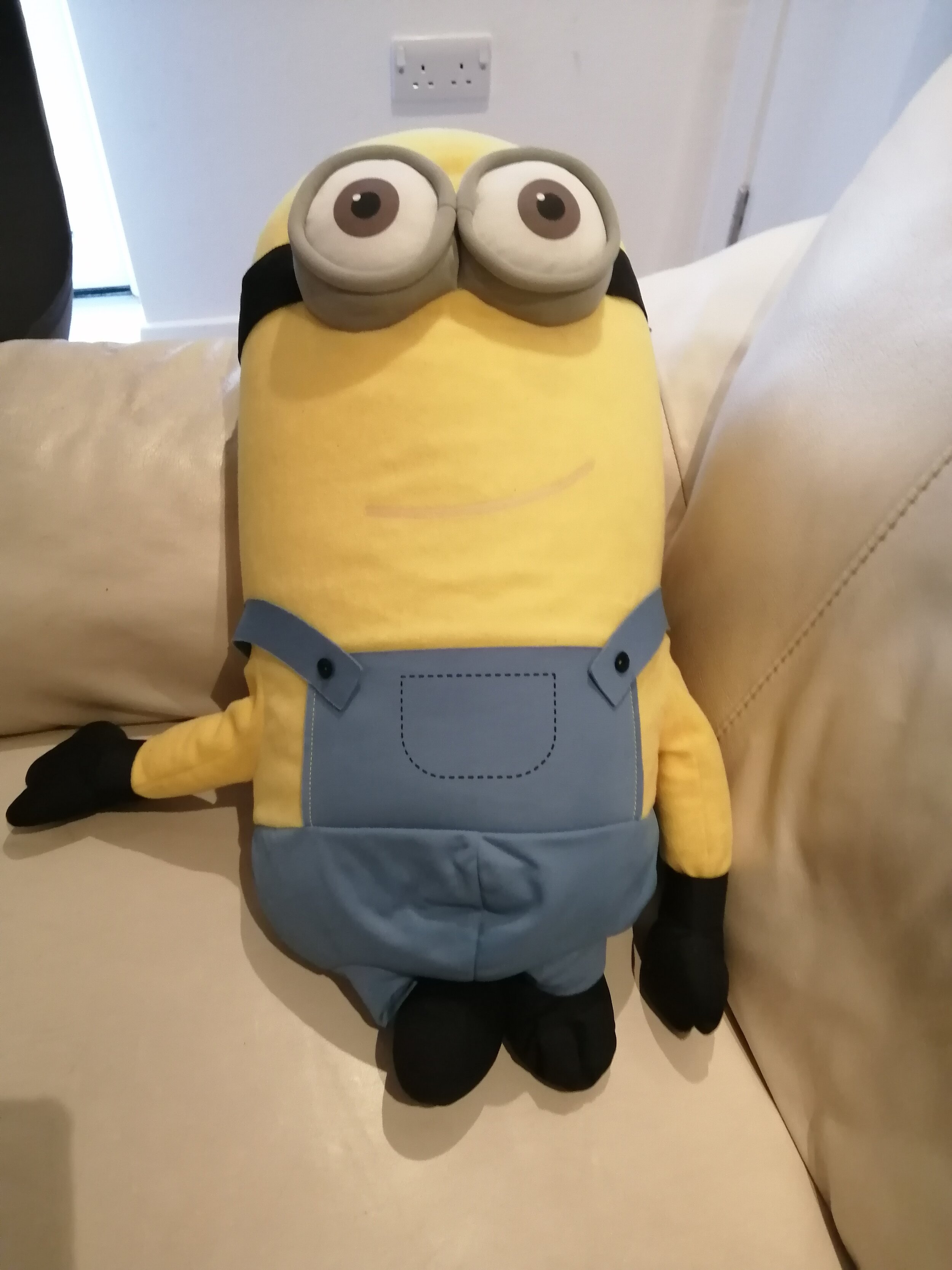
My illustrating idols sell their own merchandise, each.
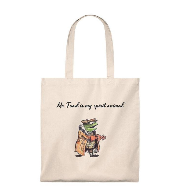
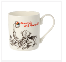
I think what make merchandises successful is; good looks, neat touching, a medium cost of money to make and sell, useful products, popular ideas.
I researched subjects too;
Logos - A logo is a name of a place, film, anything! Big bold letters are always designed in all different styles. It is mostly done in the same way, but it can get an upgrade in the future when time has passed or a movie gets sequels.
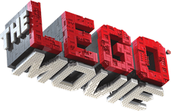
Typography - This is like illustrating and writing at the same time! They should be easy to read but nice and interesting to look at too. Typography letters can be used with drawings and shapes too to tell a story or make people feel some way.
Fonts - They are the styles of the letters like Helvetica, Comic, etc. You can make up your own fonts in your own style.
Slogans - Now this is a motto or a catchphrase for companies and franchises. It’s always the same, just like the name and logo, so people will remember and recognise it. For example....
· The LEGO Movie - Everything Is Awesome!!!
· McDonald’s - I’m Lovin’ It!
· Burger King - Be your way.
· Kit Kat - Have A Break... Have A Kit Kat.
· Thomas & Friends - Making Tracks To Great Destinations
· Dr. Seuss - Dr. Seuss Makes Reading Fun!
Characters – I’m great at drawing characters. I thought about what new character I could draw that would make good merchandise. I designed a good-looking bee character inspired by the Manchester Bee but in the original Justin P. Lees Style. And I drew my bee doing lots of relaxing things, like sun-lounging on vacation, dancing while listening to music, watching a movie, taking a dip in a pool, having fun at a theme park or even eating favourite food (pollen, that is). I chose to do a slogan for my new illustrations too know as ‘DON’T BEE TOO BIZZY!’.
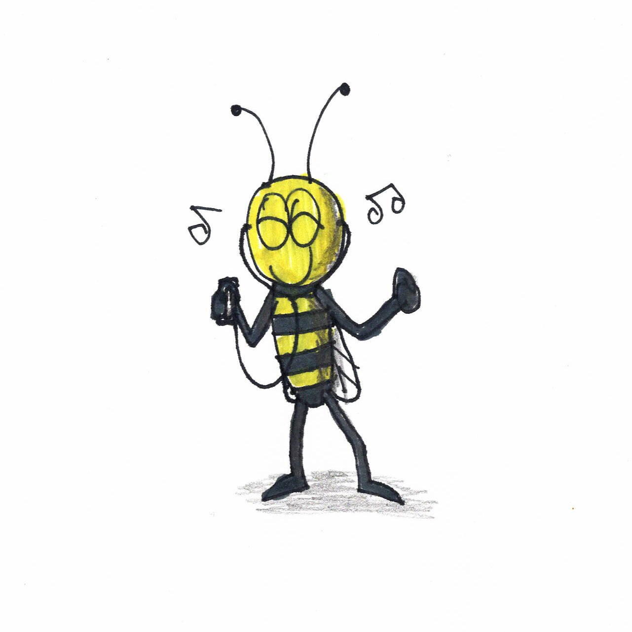
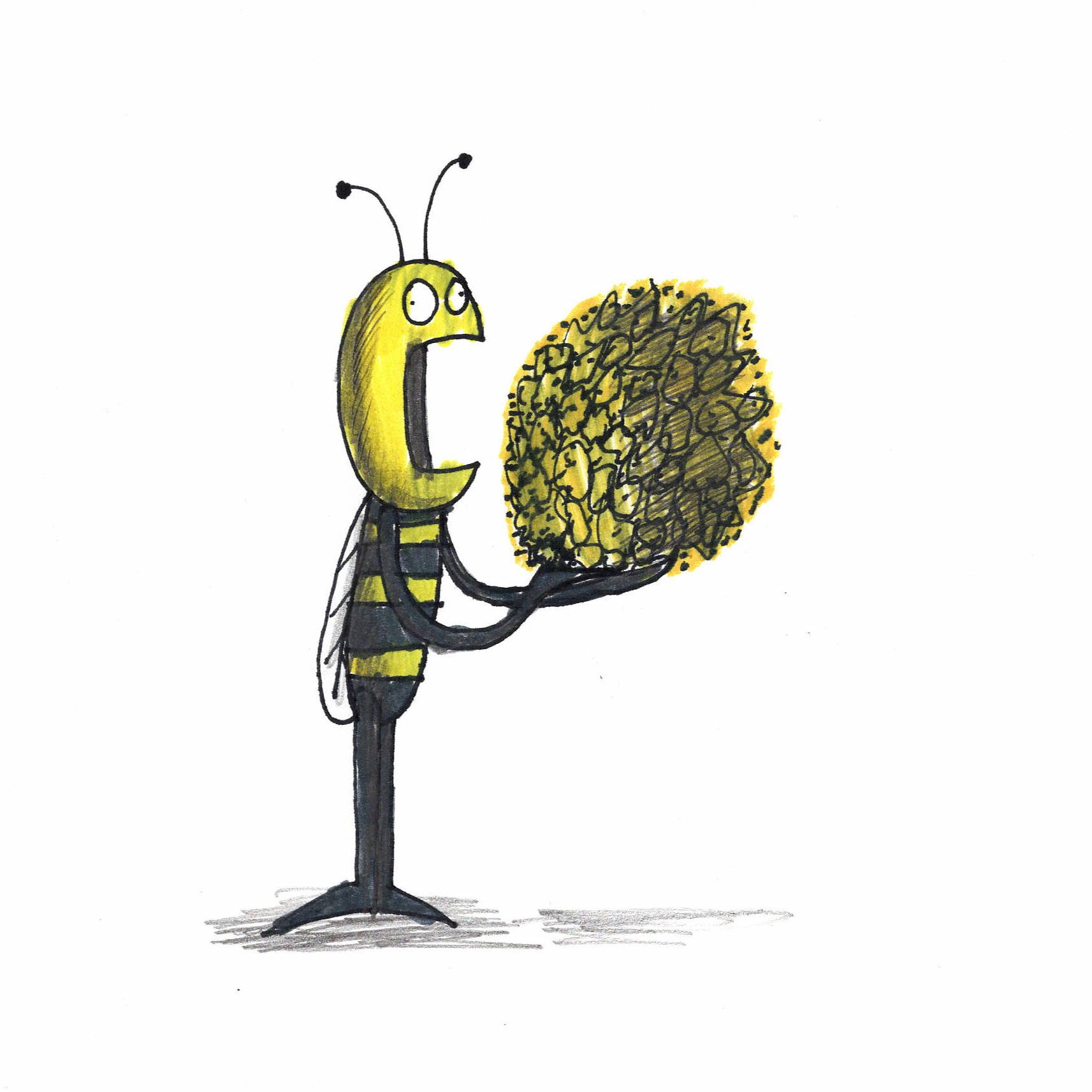
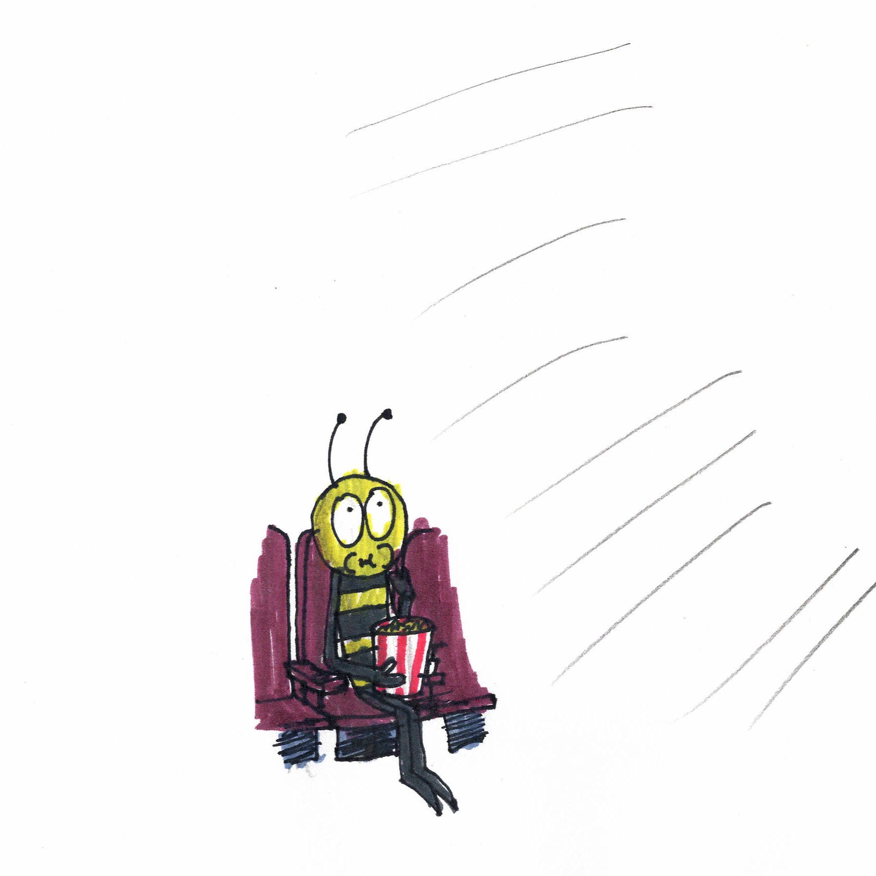
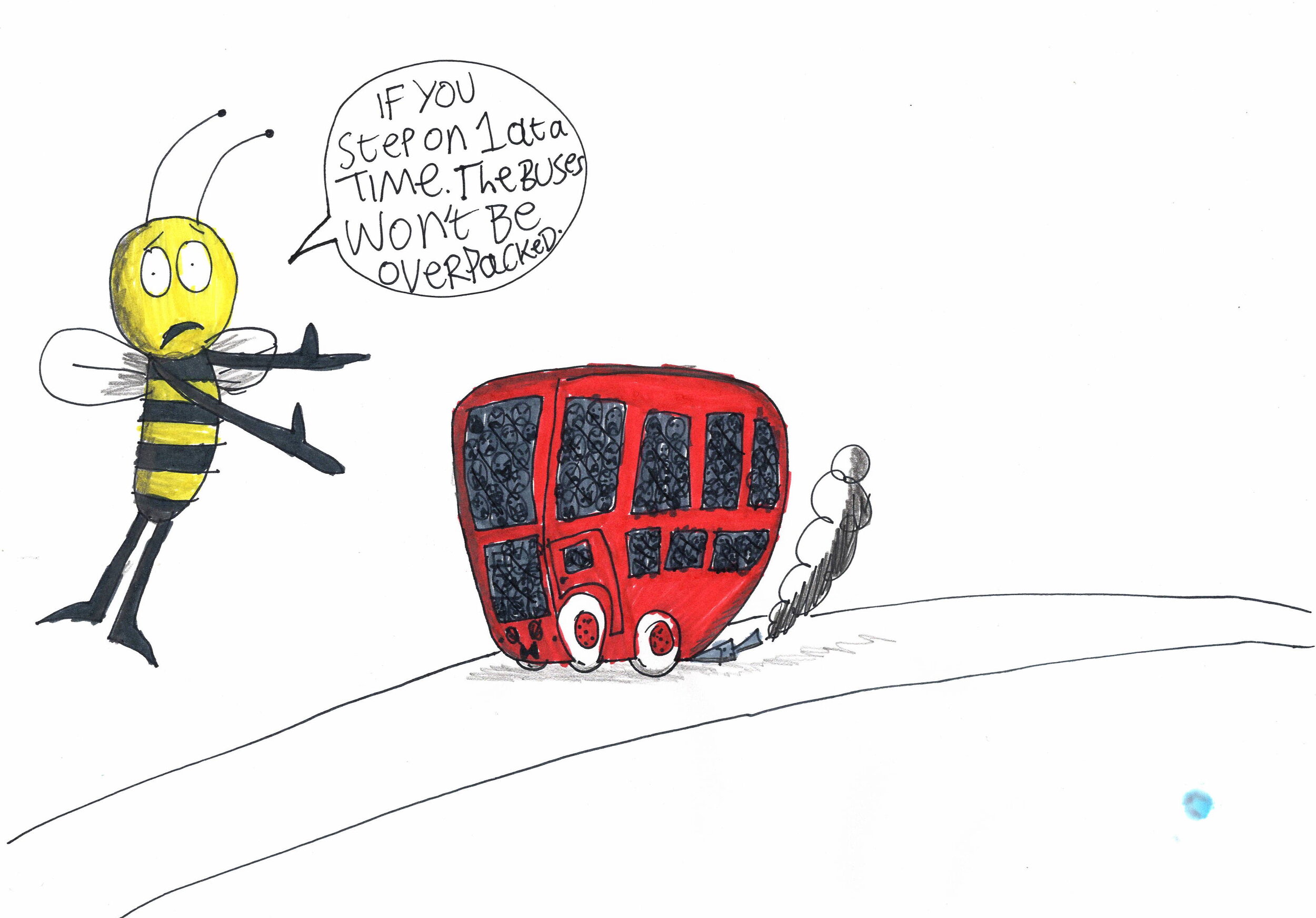
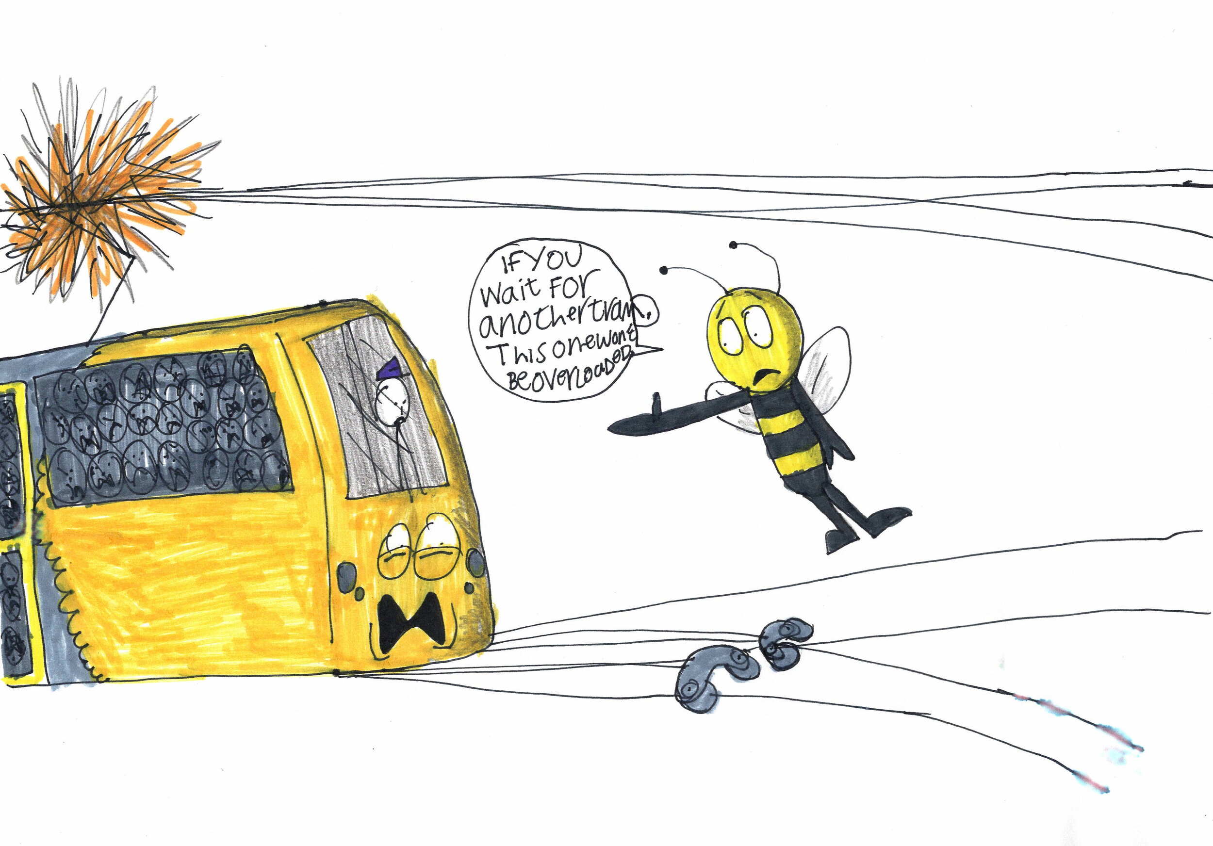
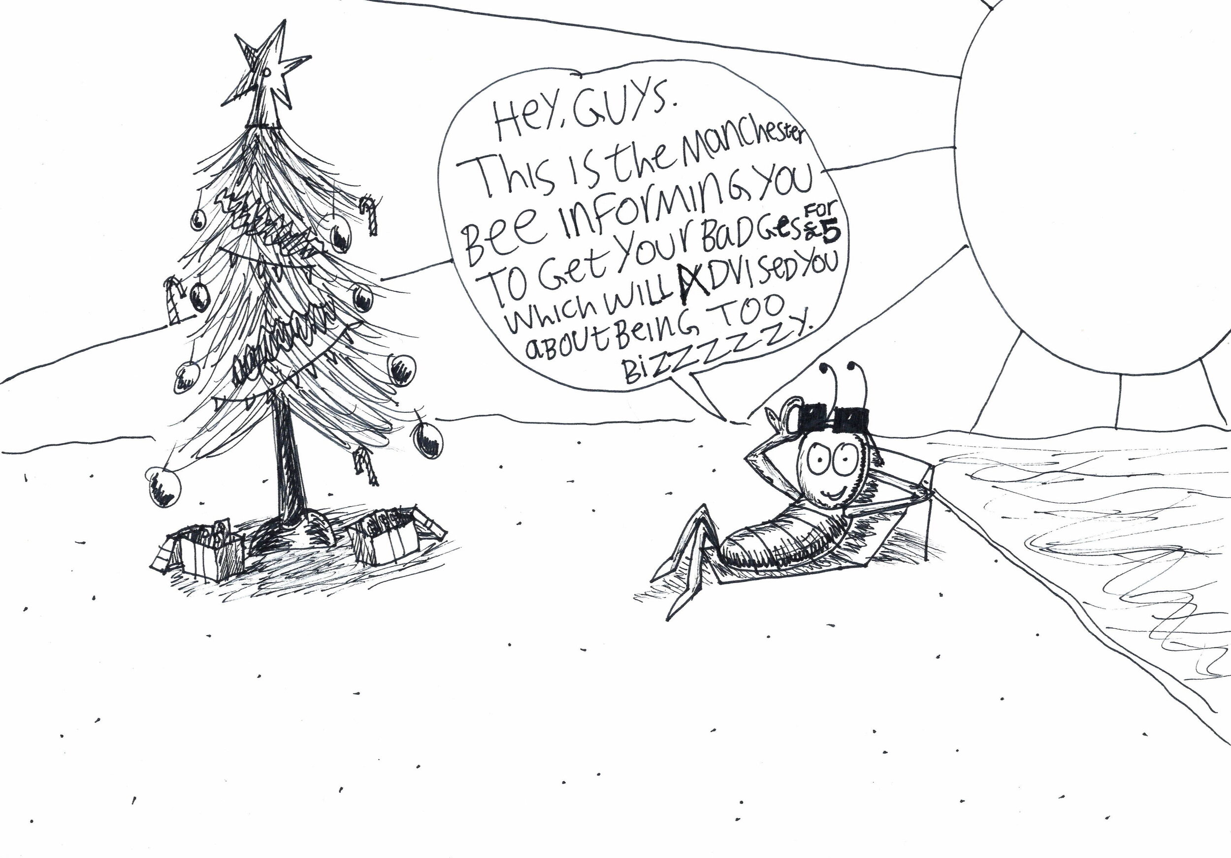

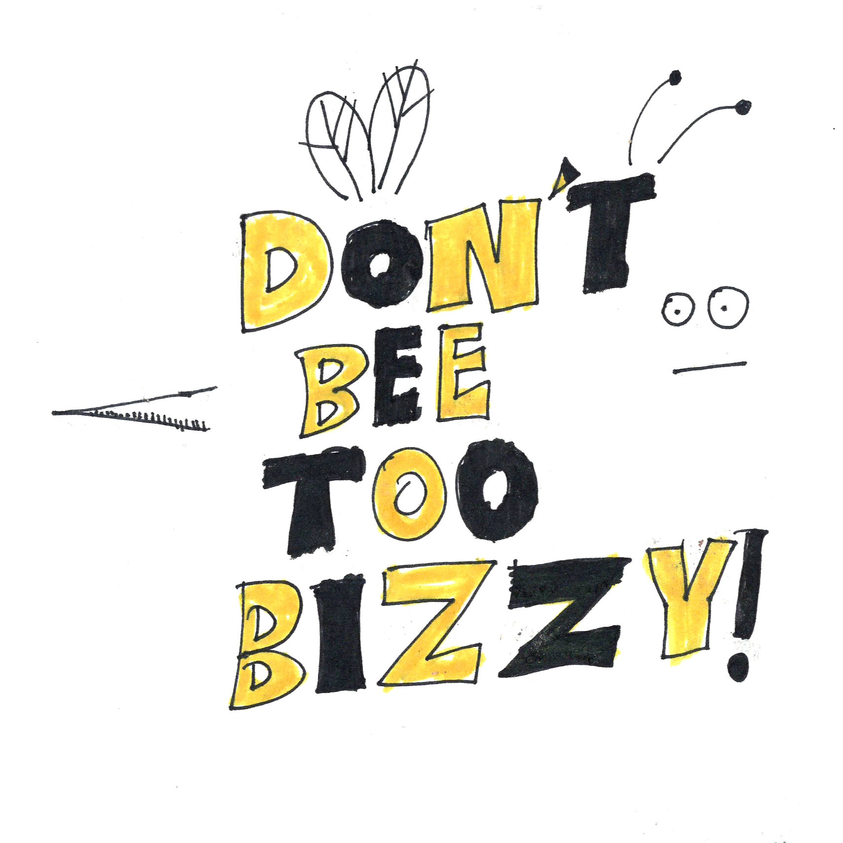
I did some practice with my illustrations on a mug, a bag and a t-shirt. BUT, the final project, I decided on, was the ‘DON’T BEE TOO BIZZY!’ badge.
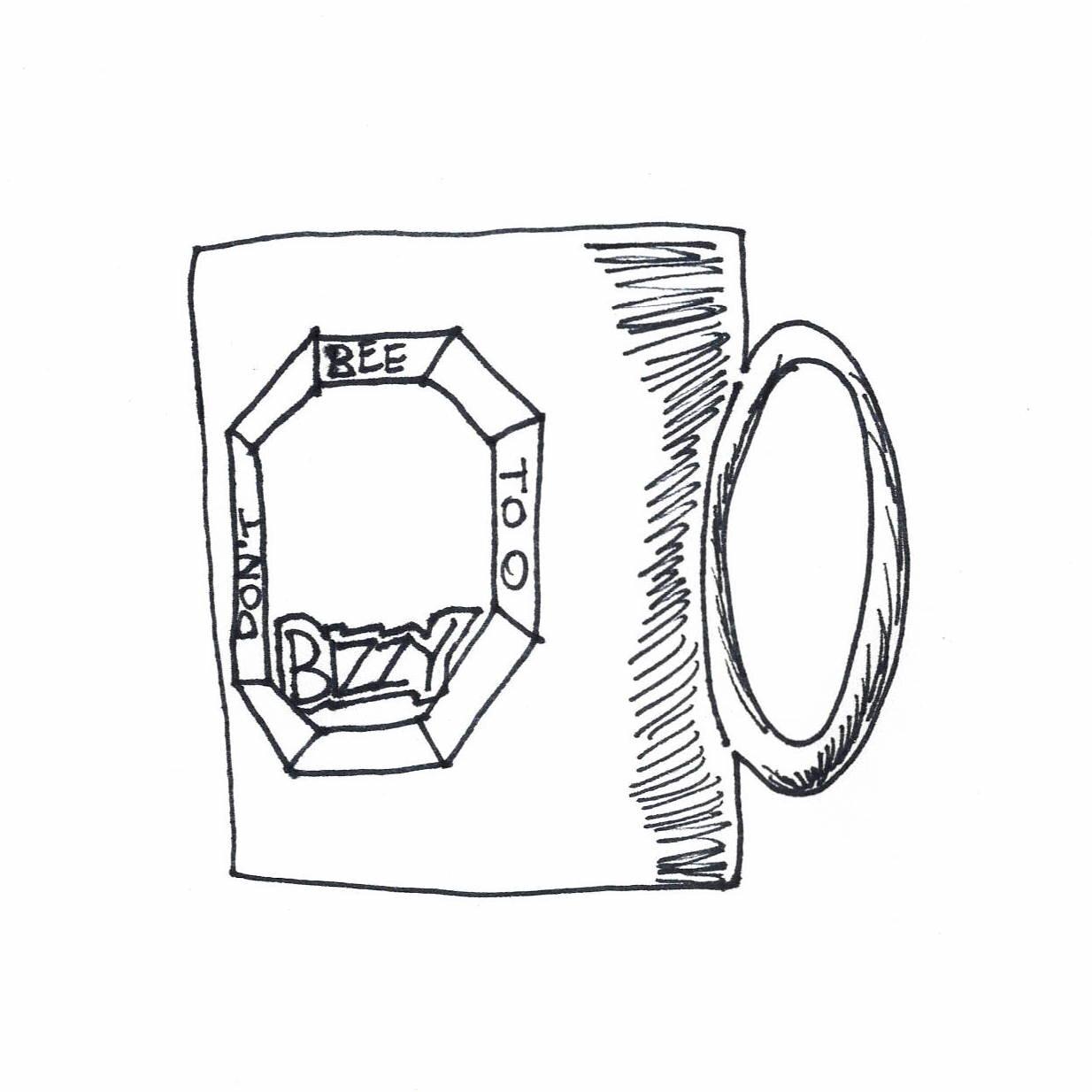
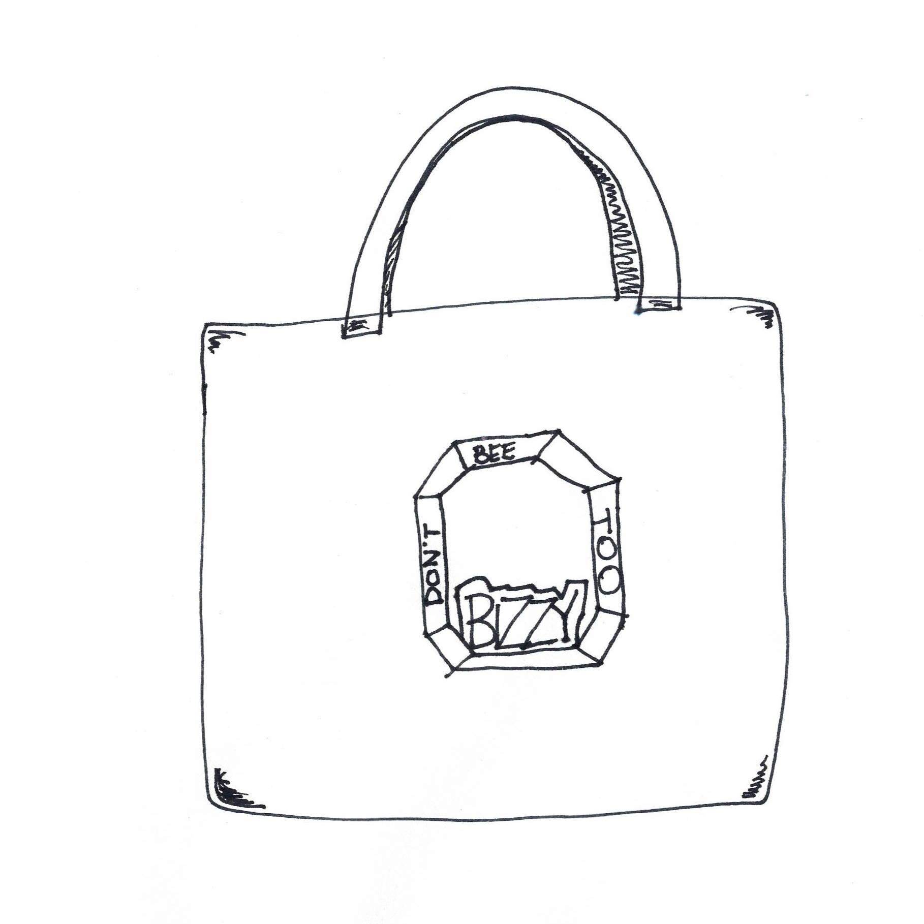
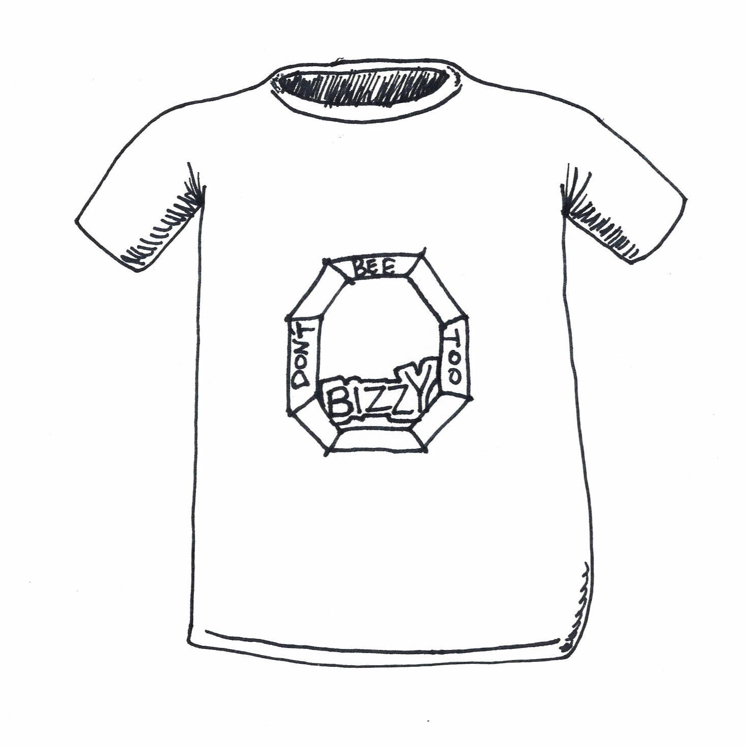
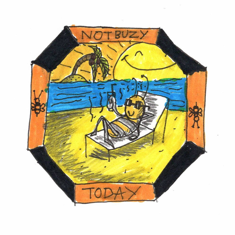
My badge design got turned into a digital drawing and sent to a proper merchandise making factory!
So, I know what you're thinking, why did I design a badge like this? Well, to be honest, I feel like the area of Greater Manchester is completely a hustling place. And I was always wishing that the area could be calm for a change (but now for a long moment it actually is quiet, but people are still stressed due to lockdown). So I decided to take matters into my own hands by illustrating pictures of the Manchester Bee, itself, taking a well-earned rest. Check 'em out and take my advice on being busy in Manchester from them. You can even wear one all the time to be a reminder.


